The following article explains how to test accessibility of a website in an automated and manual manner, how to identify and fix issues.
https://dev.to/ilizette/how-i-test-a-website-for-accessibility-167g
In today’s lesson, I’ll guide you through my approach to accessibility testing. We’ll explore utilizing Google Lighthouse for automated a11y testing, delve into manual testing with keyboards, and learn how to emulate various media states, and visual impairment using the Chrome browser.
For this article, we’ll be testing this demo webpage on CodePen. I intentionally made the webpage inaccessible and included common errors. We will fix these issues together.
Automated Testing using Lighthouse
Lighthouse is an open-source tool that was created to help improve the quality of a website. We’ll be using it to test for accessibility, It gives quick results in just a few steps. We’ll be using Chrome to test since the lighthouse is built-in
Step 1: Fork and activate debug mode on the pen
This action will generate a temporary URL for testing purposes. Debugging in the CodePen’s debug view simplifies the process, eliminating the need to inspect through an iframe.
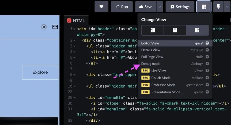
find debug mode on codepen
Step 2: Open Lighthouse on Chrome devtool
Pop open your browser’s DevTools and head over to the Lighthouse tab. Since we’re focusing solely on accessibility testing, uncheck all the other category options except Accessibility.
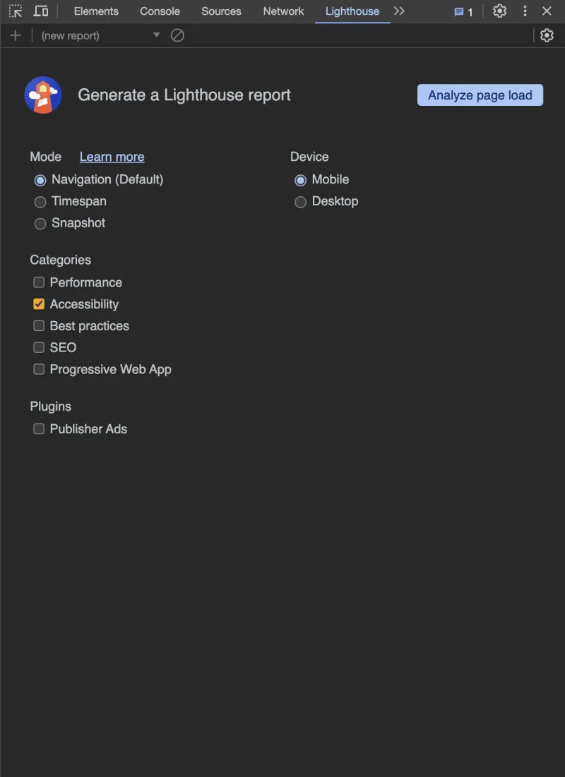
lighthouse interface
Click the “Analyze page load” button, and let Lighthouse run its test.
After the wait, Lighthouse will show the calculated score and a detailed list of issues that were found. In this case, we got 68% (orange) on accessibility.
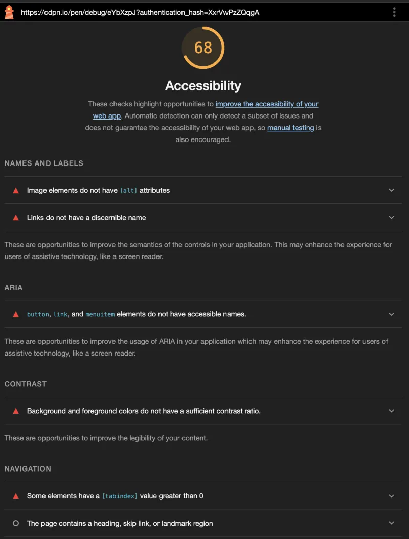
Lighthouse test score 68% on accessibility and list of issues found
Now, if this were my math test, I might call it a win, but in the world of accessibility, we’ve got to do better than this, right? 👀
So let’s uncover the issues and fix them one at a time.
Issue 1: NAMES AND LABELS
- Image elements do not have [alt] attributes
To fix that we just add the alt attribute to the images. Image alt text should be short if they’re supposed to be informative or left empty if they’re purely for decoration.
<img alt="a brown building" src="https://source.unsplash.com/kn_ANxnwCQ0/400x300" class="lg:w-10/12 lg:object-cover inline-block mx-auto" />
- Links do not have a discernible name
When incorporating links, it’s crucial to provide users with clear information about the destination. If the link is an image, it can be fixed using an alt text. In our demo page, we have several SVG images wrapped in a link. To fix this, we’ll add role="img" attributes to the SVG tag and include a <title> tag within the SVG.
<svg role="img" width="25px" height="25px" viewBox="0 0 24 24" fill="none" xmlns="http://www.w3.org/2000/svg">
    <title>Contact me via email</title>
....
Issue 2: ARIA
- button, link, and menuitem elements do not have accessible names.
Lighthouse conveniently highlights the specific code where it detects an issue, making it easy to pinpoint. In this particular section, the problem stems from the following code and other parts where it’s repeated.
<i role="button" tabindex="1" class="fa-solid fa-chevron-right fa-rotate-180" style="color: #9da3af;"></i>
In this instance, a role="button" is present, but the absence of a title leaves no descriptive information for screen readers to convey. To fix this issue, we can add a title attribute or an aria-label. In this case, we’ll opt for the use of aria-label.
<i role="button" aria-label="Previous" class="fa-solid fa-chevron-right fa-rotate-180" style="color: #9da3af;"></i>

<i role="button" aria-label="Next" class="fa-solid fa-chevron-right" style="color: #323439;"></i>
Issue 3: CONTRAST
- Background and foreground colors do not have a sufficient contrast ratio.
Web Content Accessibility Guidelines (WCAG) set rules to make sure the contrast between a background and a foreground color is good enough for everyone to read, especially for those with vision challenges. So, as a developer, it’s about picking colors that play nicely together, making your content accessible to as many people as possible.
In our demo, we’re using a light turquoise color on a white background.
To rectify this, We have two options: increasing the font size and making it bold, or changing the color. For this demo, we’ll opt for a color change. Lucky for us, chrome DevTools can help us identify an appropriate color with the right contrast.
Let’s correct the contrast:
Navigate to the Element tab in the devtool and select one of the turquoise texts on the white background. Under the styles section find the
text-colorand click on the turquoise square to show a color wheel popup. The popup also shows the contrast ratio which is currently1.96. Click on the dropdown and the color wheel will now have two lines.Head to the Element tab in the DevTools and choose one of the turquoise texts on the white background. In the Styles section, locate the
text-colorproperty, and click on the turquoise square to reveal a color wheel popup. This popup displays the current contrast ratio, currently at 1.96. Click on the dropdown, and the color wheel will now show two lines.
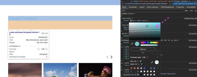
chrome color wheel with contrast information
The colors under these lines will meet the criteria for a sufficient contrast.
…
In the CSS let’s update the color
:root {
--main-color: #016d73;
--secondary-color: #94bbe9;
}
Issue 4: NAVIGATION
- Some elements have a [tabindex] value greater than 0

failing tabindex code
Please note that you might not see this issue if you selected the desktop option before running the analysis on lighthouse; This only shows on mobile
Using a tabindex value of 0 for both elements is just fine and will work exactly as expected. Using a value greater than 0 will jump ahead of everything else in the tab order and these often create poor experiences for users who rely on assistive technologies. Now there are instances where using a value greater than 0 could be valid but not in this case.
Let’s fix this:
<i role="button" tabindex="0" class="fa-solid fa-chevron-right fa-rotate-180" style="color: #9da3af;"></i>
<i role="button" tabindex="0"  class="fa-solid fa-chevron-right"></i>
After addressing all of the issues from lighthouse rerun the test.
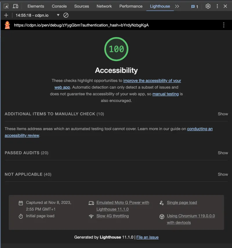
Updated lighthouse score
This time we should get 100 (green) on lighthouse. Here’s the updated pen after fixing the automated testing issues
However, that’s not the end of testing for a11y. Automated testing is just a part of the process. Lighthouse doesn’t test for all instances a11y. So the next process is to do a manual test.
Manual testing
When testing for a11y manually there are several factors to test for, e.g.: trying to navigate the website only using a keyboard, using a screen reader, trying to emulate different media types, and visual impairments.
Running a manual test on our updated demo:
Semantic tags
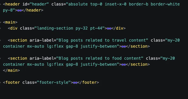
A glance at the code will reveal that we used divs for page structure. The code doesn’t look so structured and it’s the same for users accessing the website through a screen reader. Let’s fix that:
updated semantic code
In the picture above, I have replaced the page structure with their semantic elements, using the header, main, footer, and section.
Keyboard navigation test
Now let’s try navigating the website using the keyboard. Using the tab key. You’ll notice that there’s no way to know exactly where we are on the website. This is because there’s no focused state on the site.
When I was new to HTML I used to disable the default focus state of links, buttons, and inputs on the website because they don’t look so good. Later on, I realized that they serve their purpose.
In the CSS file, you’ll see that I have disabled the focus style.

removed outline style on focus
Instead of just removing the focus style we can change it. For this example, I’ll use a border style.

updated focus style code
Now if we try navigating with the keyboard you can see the links are selected when they’re focused. I think this looks better.

focused link style on website
Great!, if we continue navigating through the keyboard you might notice a part that was skipped that shouldn’t be, that’s the the previous and next icons. Did you notice it? 👀.
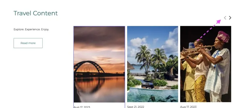
previous and next slider icons
Keyboard users should be able to access that section because it’s a CTA button to move the slider. So let’s fix this:
There are multiple fixes for this but the simplest fix is to warp a button around the element.

Updated a11y fix
Test the site again, the keyboard navigation is fantastic.
Form test
The subscribe form at the footer looks okay and it could probably pass for accessibility since it is a form with one input.
- the placeholder is acting as a label (This might pass in this case but if you have multiple inputs then a user might forget what they’re supposed to fill into a particular form because there’s no label)
To fix this let’s add a label to the input and change the placeholder text.
We can also improve the experience of this form by adding an autocomplete to the input field.

updated form code
In the image above, I have also added a form title and added (required) to the label to let the user know it is required.
Here’s the updated pen for manual testing of our webpage.
We have improved the experience of this webpage and it’s accessible!

Conclusion
There are several other aspects to consider when testing a website beyond the ones covered in this article. When developing a functional site, it’s important to test transitions and animations. Depending on the type of animation, it may be necessary to use reduced motion and ensure it functions properly. Additionally, it’s a good idea to test font sizes to ensure that users with blurred vision can still read the text on the site without difficulty.