The following articles tackles the issue of editing text on mobile devices (both Android and iOS), explaining the pain points around it and how they can be solved.
Whenever I explain my research at Google into mobile text editing, I’m usually met with blank stares or a slightly hostile “Everyone can edit text on their phones, right? What’s the problem?”
Text editing on mobile isn’t ok. It’s actually much worse than you think, an invisible problem no one appreciates. I wrote this post so you can understand why it’s so important. But as it’s a rather nuanced issue, I may lose you. To help, I’ve sprinkled lots of headers throughout so if you get bored, just skip ahead.
TL;DR
Android and iOS share a common problem: they copied desktop text editing conventions, but without a menu bar or mouse. This forced them to overload the tap gesture with a wide range of actions: placing the cursor, moving it, selecting text, and invoking a pop-up menu. This results in an overly complicated and ambiguous mess-o-taps, leading to a variety of user errors.
It’s less of a problem if you only do short bursts of text in social media or messaging apps. But doing anything more complicated like an email gets tedious. However, in my user study on text editing, I was surprised to find that everyone had significant problems and rather severe workaround for editing text.
With the extremely talented Olivier Bau, together we created a prototype called Eloquent, which offers a much simpler solution. We presented this work at UIST 2021.
Yes, text editing really is a problem
In 2017, while working on Android, I had some questions about text editing and started asking around for existing user studies. I assumed that for something so core to the user experience, we would have at least a few studies. Looking back over seven years of research, I couldn’t find a single one on text editing. I was a bit stunned.
Text editing on mobile was considered “good enough.” Since people weren’t complaining, there was little motivation to improve it. However, I decided to conduct my own study, and the results were surprising. I gave 10 participants a simple set of text editing tasks, such as deleting an “x” from a string of characters or moving a word to the end of a sentence. Every single person had problems with targeting, using the clipboard and lots and lots of errors.
I asked the participants about their overall experience editing text on mobile devices. They all expressed frustration, but not so much with messaging or social media apps, where they typically only needed to write short bursts of text. However, when it came to composing more complex text, such as multiple-sentence emails, they often said things like, “I’ll start it on my phone, but if it gets too complex, I’ll just finish it on my laptop.” Even more surprising, over half of the participants said that instead of editing text, it was easier to just select all, delete, and retype, bypassing editing entirely. This is not a sign that things are working well.
Just to be clear, the problem here isn’t entering text, but with editing it. With better keyboards, voice transcription, and physical keyboards on many tablets, getting text into a device is not the problem it used to be. However, you will always want to edit your words afterwards.
While my research focused on fixing text editing problems on Android, I want to be clear that iOS, which has some significant differences to Android text editing, still has many of the same problems.
Text editing is a hack
Mobile devices were originally designed for consumption. The revolution of flick-scrolling made it easy to move through content. The superpower of mobiles was their on-the-go consumption of videos, photos, social media, and messaging. These are valuable tasks but require little text editing. People forget the original iPhone didn’t even have clipboard support!
Yet over the last 10 years we’ve heard over and over that it’s only a matter of time before everyone will be using tablets for everything. Apple ran an add a few years ago “What’s a computer?” and in 2013, Google tried a “Tablet Tuesdays” campaign to get it’s workers to use their tablets all day while at work. Tablets continue to sell fairly well but as a desktop replacement, it’s been, let’s just say, less than a resounding success.
This has been written about quite extensively, I’m not really saying anything new here. However, people don’t seem to agree why. It’s not that some people can’t be productive on tablets. There clearly are people that can make this work. But most can’t. Why is that?
There are likely many reasons, but I would argue that there are a few deep foundational UX problems with tablets that hinders productively. Text editing is one. Another is file handling, something I’ve previous written about if you’re interested. However, before anyone accuses me of being a nostalgic fool, I want to be clear that I am not anti-mobile. My goal is not to return back to the desktop, but to move mobile forward. How can we actually use our fix our phones and tablets to be as productive and fast as we are on desktop systems?
Start with desktop text editing…
Text editing on desktop has a long and interesting history, but let’s focus post 2000, where it started to stabilize. Every desktop OS has a mouse cursor that can be moved accurately with a mouse or trackpad, making it easy to click on the exact character you want.
Selecting text is also quite simple: after clicking down on the mouse, an additional drag of the cursor selects more. Then an EDIT menu with the classic Cut/Copy/Paste commands let you act on your selection. For must faster actions, the command keys X, C, and V made it significantly faster.
The combination of these three features—an accurate pointer, simple selection, and a menu with command keys—made text editing easy, relatively error-free, and unambiguous. To be fair, one can imagine improvements to this system, and I don’t wish to imply that it is perfect. It is simply the baseline against which I am comparing mobile text editing.
…and then poorly copy it
Given how prevalent desktop UI was when mobile was launched, it’s not surprising that it tried to copy desktop editing. The problem is that there was no mouse pointer and a menu bar with command keys. This meant it had to make significant compromises.
For example, instead of clicking with a mouse pointer, mobile devices use a finger to tap. This means that placing the text cursor is less accurate. This is well known in UX research as the ‘fat finger‘ problem. This is why user interface guidelines suggest buttons to be fairly tall and wide as bigger targets are easier to hit. However, text characters can’t be made big enough. This usually results in placing the text cursor a bit to the left or right of where you intended.
The targeting problem has led to a cascade of new interaction mechanisms that technically solve the problem but have unfortunate side effects.
The 4 changes mobile made to text editing
1. Text Handles
Mobile adds a teardrop handle to the bottom of the text cursor. This allows the text cursor to be seen more easily and gives a handle to drag the cursor to the correct position if you miss. This all seems pretty reasonable right?
Actually, no! This creates our first ambiguity. The text handle is itself a tap target. Unfortunately, so is the text surrounding it. We now have two potential tap targets. When they are far apart, it’s fine. The problem only occurs when I want to tap just to the left or right of the text cursor. In this case, it’s unclear what the user wants: to move the cursor or to tap/drag the handle.
We saw this in our user testing when users tried to place the text cursor accurately: they would miss by a few characters and tap again to the side but the text handle would take priority and ‘eat the tap’ incorrectly assuming that the user wanted to drag it. On the desktop, if you clicked in the wrong location, you’d just click again to move the cursor, there was no ambiguity. While this isn’t disastrous, it adds friction. Worse, it’s the start of a trend. As we get to the other changes below, this input ambiguity will grow worse.
iOS doesn’t have a teardrop handle but it’s text cursor still has the same ‘eat the tap’ problem.
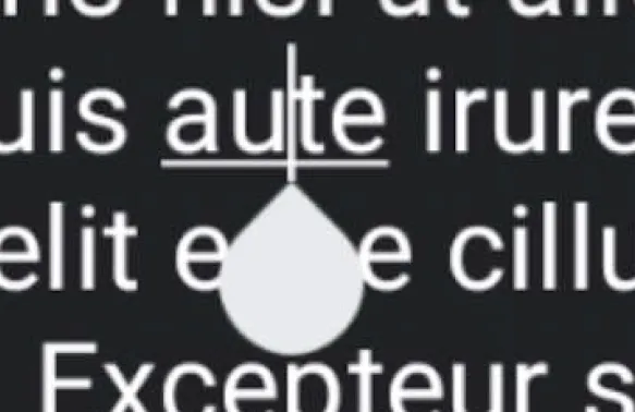
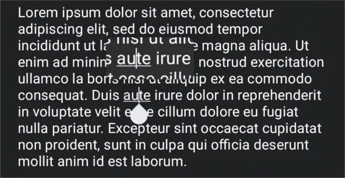
2. Magnifier
Because the text on mobile devices is so small and the finger is so relatively big, mobile devices added a magnifying glass.
There are two issues with the magnifier. First, it doesn’t help you very much before you tap to place the cursor, it’s more there to help you correct your mistake. It does this by making it easier to see where you are dragging. Second, It’s visually confusing. By floating above your finger, it creates two visible cursors: the real one under your finger and a duplicate in the magnifier. It’s actually not that bad with very short text fields, but with longer emails, it’s easy to get lost and not be sure where you are in the text.
Android Magnifier is visually confusing in large text fields.
Apple’s magnifier is even more chaotic, vanishing in iOS13 and returning in iOS15.
3. Selecting text
On desktop, selecting text was a natural extension of mouse clicking by keeping the button down and dragging. With mobile this isn’t possible so there is a completely new gesture, double tap. Wait, there is actually a third gesture long press, which also works. Both do the same thing. Don’t look at me, I didn’t design this….
However this new gesture causes more friction as decoding a ‘double tap’ must wait a bit to see if another tap is coming, so this usually delays the effect of a single tap. This means the text handle has another way to ‘eat a tap’.
However selection is still not done as you often want to select more than a single word. To solve this problem, the text cursor handle is at both ends of the selection. This allows you to extend your selection by dragging it at either end. This means selecting a few words is actually a two step process: select a word and then drag the selection handles. This compound set of gestures to edit text, like placing the cursor described above isn’t horrible, but it isn’t nearly as elegant as desktop and definitely adds yet more friction.
4. Popup menu
As there is no menu bar with mobile, there needs to be some way to invoke the clipboard commands. This is done in two ways. The first is the most obvious: as soon as there is a text selection, show a menu above the selection. This is visually a bit busy but it doesn’t create any tapping ambiguity. This works fairly well for cut/copy but is more problematic for pasting, which usually doesn’t start with a selection. The solution is a bit hidden: you can bring up this same menu by tapping the text handle. This means users have to learn TWO different gestures to bring up the menu. iOS is nearly the same.
This problem is made even worse on Android as the text handle actually disappears after 4 seconds of inactivity. The reason for this is that the handle slightly obscures text beneath it. This makes the menu completely unavailable. If you want to bring up the menu, you have to tap again to make the handle appear and then tap the handle a second time. It’s no wonder people are confused.
This menu-on-handle-tap adds yet another targeting ambiguity. A common problem with trying to place the cursor is that the user accidentally taps the handle which brings up the menu.
For highly proficient users, this gets even worse as their is no command key equivalents for cut, copy, or paste. Whether you are a beginner or expert, you must use the menu in the exact same way. Imagine if on the desktop, everyone had to use the Edit menu to cut and paste text. This is just lazy design. While we should always take care of novice users first, we shouldn’t ignore proficient users. Part of the unspoken reason desktop clipboard use is so high is the speed in which it can be used. Mobile has none of this.
How a tap can be misinterpreted
These extra mobile hacks that shoehorn desktop text editing into the mobile experience are functional, they get the job done, but each one adds another way a tap can be misinterpreted. Each time the user taps one of these actions can occur:
- place the cursor
- bring up the menu (if there already is a cursor)
- start a drag
- start a double tap
- start a long press
If you are very deliberate, these separate actions can be managed. This isn’t a complete train wreck. My point however is that it is fragile. There are just so many ways the user can end up surprised. Here are some of the errors I saw in my user testing:
- Problem 1: When a user taps, due to the fat finger problem, they miss the location they wanted.
- Problem 2: If they tap slightly to the side to place the cursor correctly, they tap the text handle and the menu comes up, confusing them. They are forced to tap away to dismiss the menu and try again.
- Problem 3: Instead of getting the menu, their second tap is interpreted as a trivial drag and nothing happens.
- Problem 4: If the user attempts a double tap, but taps a bit to the side, or hits the text handle, the OS misunderstands and nothing happens.
- Problem 5: The user wants to paste into an empty field and is confused as there is no text cursor and no menu. They must first tap into the empty field to get the cursor and THEN tap the cursor a second time to get the menu.
- Problem 6: The user traps to place the cursor but looks up to talk for a second, During this brief pause, the text handle times out and disappears. Looking down they want to tap the handle but don’t see it and are confused. They have to tap again.
All of this friction starts to add up. Each of these changes, on their own, seem reasonable. However, taken together they add a significant amount of errors and friction to the process. In my study of 10 users, it took 5 attempts on average to place the cursor accurately. We had one user tap 19 times! It’s no longer a surprise why so many of our test users just gave up on text editing, retyping everything instead of actually editing the text.
Obviously, text editing on mobile is possible as millions do it every day. My point isn’t that “it’s impossible” but a much more subtle “it’s much harder than we think”. Many of you will just say “get a grip grandpa, it’s not that bad” and dismiss my concerns. But keep in mind that most text created on mobile is short and low effort, usually messages and social media comments. Editing is rarely needed so this friction doesn’t matter so much. I’ve also had many people tell me of students writing entire papers on their phone. That’s right, it’s possible! Lots of people run marathons too, that doesn’t mean everyone is able to.
If you don’t believe me, please try doing some significant text editing on either Android or iOS. Just use voice input to dictate a quick paragraph and then try to clean it up. Pay attention to how many errors happen and then honestly tell me that it was a simple and easy experience.
If we want mobile to replace desktop (or at least compete with it), it has to grow beyond these backward looking tap-hacks to something designed specifically for mobile. Instead of poorly copying the desktop, we should lean into the touch experience to create something fluid, clear, and much simpler.
Eloquent: one path forward
Before I go into the details of Eloquent, I want to emphasize that my primary goal in this post is to fully describe the problem. Make this invisible problem visible to you. Many people don’t realize how bad it is. Given this, I hope we can agree that something needs to be done. You may not agree with Eloquent, and that’s fine. I hope that other, even better solutions will be suggested.
Since this post is already quite long, I will list the key things we tried below, but I will rely on the introductory video I made for UIST to give you a more complete demonstration of our efforts. Because the problem involves the collision between tapping, selecting, the magnifier, and menu usage, it is difficult to fix the problem without addressing all four simultaneously.
Simplified cursor placement
Our core goal was to create a tap action that is completely unambiguous, similar to the simplicity of a mouse click on desktop. We wanted a tap to always place the cursor. As mentioned above, one problem with today’s text handles is that they “eat” the cursor, thinking it is the start of a drag or menu. We unified this logic so that any time the finger touches the screen, it is considered the start of a drag. A tap is simply a very short drag. This means that if you tap to the side of the handle and lift quickly, the cursor will jump to the new location; if however you drag slowly, the cursor drags to the same location. Problem solved.
Visually, we always keep the text handle visible. We didn’t want it to come and go. This encourage users to drag, which is more accurate than tapping. We made it semi-transparent so that it didn’t obscure the text. This made the cursor visually stable and eliminated the 4-second timeouts.
Unified magnifier
By having the magnifier integrated over the text cursor, it simplifies the visual presentation so the user is always looking at the cursor in context. As Eloquent is so drag focused, this improves the overall experience and encourages dragging. We use a fisheye technique to economize on space and keep the user oriented to their text.
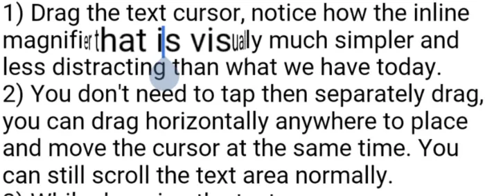
However, this approach led us to an unexpected place: it’s actually better to ALWAYS drag the cursor as the magnifier allows much more accurate placement of the text cursor. As we started using this system more, we just starting dragging immediately and narrowed in on our target. This is a new behavior but one we found was very very quick to adopt.
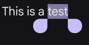
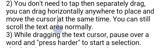
Drag Press for text selection
The main reason there is so much ambiguity today is that there is only a single tap gesture. This forces the ambiguities we’ve seen. So we created a new gesture while the user was dragging: pressing harder while dragging. This gesture starts a text selection. We used the barometric pressure sensor in the phone to detect when the user pressed. We did this as it was the only hardware sensor available to us at the time. We maintained two running averages, a long one as a base measure and a short one to trigger the event. When the short average went above the long average, we fired a drag-press event. This was remarkably robust, working well even though the sensor varies quite a bit. A more advanced mechanism, such as Apple’s unfortunately discontinued 3D Touch hardware could be a better solution.
Improved menus
Finally, we try to enable a more fluid gesture so that proficient users can actually get some much needed speed into using copy/paste. As nearly every text menu today (both Android and iOS) are hierarchical, we wanted to take this opportunity to flatten the menu as well. This wasn’t a critical goal but was such a horrible UX crime that we wanted to solve it as well. We wanted to at least try to come up with something that is more discoverable. Every single user tester found this easily and enjoyed using it.
In addition, after the drag-press starts the selction, a second drag-press brings up the menu. This allows targeting, selecting, and bringing up the menu in a single fluid gesture. As a power user feature, it’s also possible to quickly flick to invoke the menu item. This allows mobile a rough equivalent of command keys. This isn’t a backward looking hack but a mobile inspired approach where the entire process of targeting, selecting, and clipboard action can now be done with a single fluid gesture. (see the video below for a demonstration)
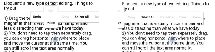
The Eloquent T-Menu uses swipe gestures for cut and paste. It also has no hierarchy and just slides off screen
Game-like animations
We added several small visual animations to help users learn and understand what is going on:
- The text cursor ‘scoots’ between locations and the handle ‘wobbles’ when it arrives. We did this to reinforce the idea that the cursor was always there. It also implied you could always drag it.
- The cursor also ‘dimples’ when you tap, invoking the magnifier briefly. The goal here is to encourage users to do more than just tap. We were trying to encourage dragging.
- When a force-press occurs over a word, we ‘inflate’ the highlight, reinforcing the gesture.
- Swipe menu gestures animate the selection in the direction of the swipe. Swipe up for cut removes the selection upwards. Swipe down for paste, drops the new selection down.
Scoot, wobble, dimple, and magnifier drag animations
Backward compatibility
We made a concerted effort to make today’s existing actions possible in this new model, as we wanted to provide a bridge for existing users. For example, by making tap and drag ALWAYS drag the cursor wouldn’t work for large vertically scrolling text fields. So we did a simple check on drag-start and if it the first few pixels were vertical, we’d do a standard vertical scroll of the text field. All other drags just placed and dragged the cursor. It actually worked quite well.
Enough text, here is a quick demo that shows it off much better:
Shipping this
Unfortunately, shipping something like Eloquent would be challenging. First, as too many people mistakenly see text editing as “done”, there is little appetite to fix it. Second, users have been trained to cope with this error-prone approach for well over a decade. Asking people to change at this point would be hard.
But most importantly, fixing text editing isn’t seen as important enough in the war between Android and iOS. It’s not the flashy feature that shifts your Net Promoter Scores. What I find ironic is that a fundamental change, like fixing text editing, could make people feel much more at ease using their phones and could be an enormous reason to switch. But it would be a slow burn and take years of steady effort. Android just can’t think this way. Apple just might.
It’s too bad, because I’d like mobile to grow and be even more productive than desktops are today. But the way we’re going, we’ll be editing text this way for the next 20 years at least. Do we really want this? Too bad text editing is an invisible problem no one appreciates.