The following is a guide on how to achieve good user experience when designing a video or board game. The author presents 10 heuristics (problems) in game design and explains why and how you should tackle them, presenting examples with real video and board games to make it easier to understand.
https://uxdesign.cc/usability-heuristics-in-game-design-29a324177d4e
Defined by the ‘king of usability’ Jakob Nielsen, the ten heuristics are broad principles underpinning excellent user experience. While they’re typically discussed in the context of digital interfaces, these heuristics are relevant for all aspects of interaction design, including games.
In this article, I will review each of the ten usability heuristics and discuss some interesting examples of applying or deliberately breaking these rules in both computer games and boardgames.
Let’s get started!
1. Visibility of system status
The design should always keep users informed about what is going on, through appropriate feedback within a reasonable amount of time.
Accurate system feedback is paramount for games with complex interaction patterns, as getting lost quickly sucks out the fun from most games. This covers both the system mapping (understanding your place in relation to other players and/or game objectives), as well as interaction feedback (the impact of your immediate actions on the system).
A neat example of a small scale interaction feedback is a character mood chart in Spiritfarer. As you interact with the passengers on your ship, you get immediate feedback on the impact of your actions on their mood. Overtime, this enables you to know each guest’s personality traits and preferences, so you can keep their spirits up.

Character mood chart in Spiritfarer gives player an immediate feedback on the impact of their actions. They quickly learn that giving Summer a hug will improve her mood and encourage her to look after the garden.
On the other hand, there are games whose thrill is largely reliant on hiding the system status. Multiplayer card games often encourage players to intentionally mislead others about the impact of their action. They may deliberately take seemingly disadvantageous steps to gives a false impression about the value of their hand until the final reveal.
2. Match between system and the real world
The design should speak the users’ language. Use words, phrases, and concepts familiar to the user, rather than internal jargon. Follow real-world conventions, making information appear in a natural and logical order.
Games that are based on logical and consistent rules are much easier to learn because players can navigate them intuitively. This doesn’t mean that they should represent the real world exactly (in fact, it’s much more fun if they don’t), but breaking fundamental laws of physics or established norms comes at a cost of increased cognitive load.
In Valheim — a survival video game set in the Viking afterlife — the player manages a large number of resources, both real and fictional. Memorising their individual properties would be nearly impossible if they weren’t closely based on the real world (and boring if they were its exact copies). As one might expect, berries and mushrooms are common, not very nutritious and occasionally poisonous; vegetables are good for health, while meat gives you strength and stamina. Players easily guess that combining vegetables and meat will give them hearty stews, and still get the delight of discovering that cooking monster parts such as Greydwarf eyes with Freeze glands creates delicious eyescream!
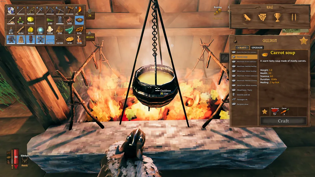
Gathering food and cooking nutritious meals for your vikings is a big part of Valheim. The game uses logical and consistent rules to help players easily manage their resources. Image source: Shack News.
3. User control and freedom
Users often perform actions by mistake. They need a clearly marked “emergency exit” to leave the unwanted action without having to go through an extended process.
Mistakes are inevitable, and only the most hardcore games enforce strict punishments. Even death itself is a part of many video games, and making the fatal error typically returns player to the last checkpoint. The length of the intervals between the checkpoints that the user needs to complete in single go is one of the key factors in defining the game’s difficulty.
In a puzzle-platform video game Limbo, the character regularly succumbs to a painful death. This outcome is very much a part of the game narrative, and there is a rare achievement for completing the game with five or fewer death.

Death is an integral part of the Limbo game narrative. The punishment is minimal — the player merely returns to the start of the chapter. Image source: Reading in the Shadows
Recovering from errors is much harder in board games, and nothing can save you from external factors like a pet jumping on a table and messing up the setup. It’s worth noting that some board games deliberately prevent error recovery from encouraging abstract thinking, such as the chess rule that forces players to commit to the move once they have touched a chess piece.
4. Consistency and standards
Users should not have to wonder whether different words, situations, or actions mean the same thing. Follow platform and industry conventions.
In addition to reflecting the real world, games also share a unique language of common principles and patterns. In board games where players control pawns moving on a grid, landing on an occupied space is either forbidden or is an act of eliminating the opponents pawns and taking control of the space. Classical games like chess, checkers, backgammon, Ludo, and many others are based on these shared principles.
Video games also use consistent interactive patterns to increase learnability. Experienced gamers intuitively know how to move characters with a keyboard or a controller: run, jump, crouch, attack, block and interact with objects because these principles are fairly consistent within each game as well as across the industry.
The fusion of the physical and digital worlds can be especially thrilling: an adventure role-play video game Black Book intentionally mimics a traditional deck-building card game setup. To perform an action, the player chooses a sequence of cards from their hand, and the setup closely resembles a physical card game.

5. Error prevention
Good error messages are important, but the best designs carefully prevent problems from occurring in the first place. Either eliminate error-prone conditions, or check for them and present users with a confirmation option before they commit to the action.
We already discussed some of the challenges in error prevention and recovery, especially in non-linear, open-world games where it’s not immediately obvious if the player is lost or happily exploring.
To help players stay on track, many video games have subtle obstacles that prevent characters from wandering off the main path. In an adventure puzzle game RiME, the character trying to swim in the wrong direction soon meets a smack of jellyfish blocking his way. Later, running dangerously close to the cliff edge, he stops and balances for a few moments, allowing the player to correct the course in case the cliff dive was unintentional.
In RiME, character balances on the edge of a cliff for a moment before jumping down, giving the player a chance to recover if the move was unintentional. Image source: Nintendo.

In board games, first player tokens, turn summary cards and final score sheets perform a similar function in helping to prevent some of the most common errors. For example, collaborative games like Aeon’s End and Arkham Horror have a complex sequence of turns alternating between the players and their enemy, so turn summary cards are crucial in making sure all actions are executed in a correct order. For a deeper dive into the subject, see this article on error prevention in board games.
Another important aspect of this heuristic is affordance — design pattern that gives visual clues as to how a user can interact with an interface. From subtly highlighting interactive elements in video games to correct pieces of the puzzle easily clicking together, these clues signal to the player that they are on the right track.
6. Recognition rather than recall
Minimize the user’s memory load by making elements, actions, and options visible. The user should not have to remember information from one part of the interface to another. Information required to use the design should be visible or easily retrievable when needed.
Deciding what information should be permanently visible without overwhelming the player is a major challenge in game design.
Many adventure and survival games have the data on the character’s health, stamina, mood etc available at all times to enable players to take preventive measures (e.g. rest, eat or heal) before it’s too late. When adventuring in For the King, players have a detailed view of all characters’ health, skills and resources, which help them make better collaborative decisions.
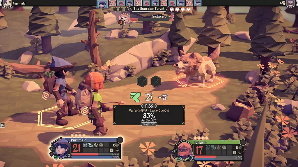
Collaboration in For the King is aided by the fact that players get a detailed view of their characters’ health, skills and resources at all times. Image source: Game Skinny.
Similarly, board games often use tokens to help players easily keep track of important metrics. These can represent available resources, like in Catan, Splendor, Takenoko; the player’s health and sanity, like in Arkham Horror; or impending doom in Horrified, etc.
7: Flexibility and efficiency of use
Shortcuts — hidden from novice users — may speed up the interaction for the expert user so that the design can cater to both inexperienced and experienced users. Allow users to tailor frequent actions.
Another major challenge of game design is tailoring difficulty to ensure the game is accessible to novice players while still challenging and fun for experienced gamers. There are a few ways to address it:
- Tutorials: some games start with a short tutorial that works as an introduction to the story and teaches the player basic rules and controls. This principle is used in video games like The Legend of Zelda: Breath of the Wild, Eternal Hope and Wytchwood.
- Difficulty level: many games allow players to select the desired difficulty, which may affect the number of enemies, severity of punishments, effectiveness of weapons and potions and so on. Again, this principle applies to survival video games like Deep Rock Galactic and Don’t Starve Together, as well as board games like Horrified and Aeon’s End.
- Progressive complexity: it’s common for games to increase difficulty with time, giving players a chance to master the basic skills before moving on to more advanced ones. Thomas Was Alone is an excellent example of this principle, as each level introduces new characters with increasingly more complex motion patterns. It’s also worth noting that this game falls short in utilising the final principle on the list — if you can’t solve a puzzle, there is no way forward.
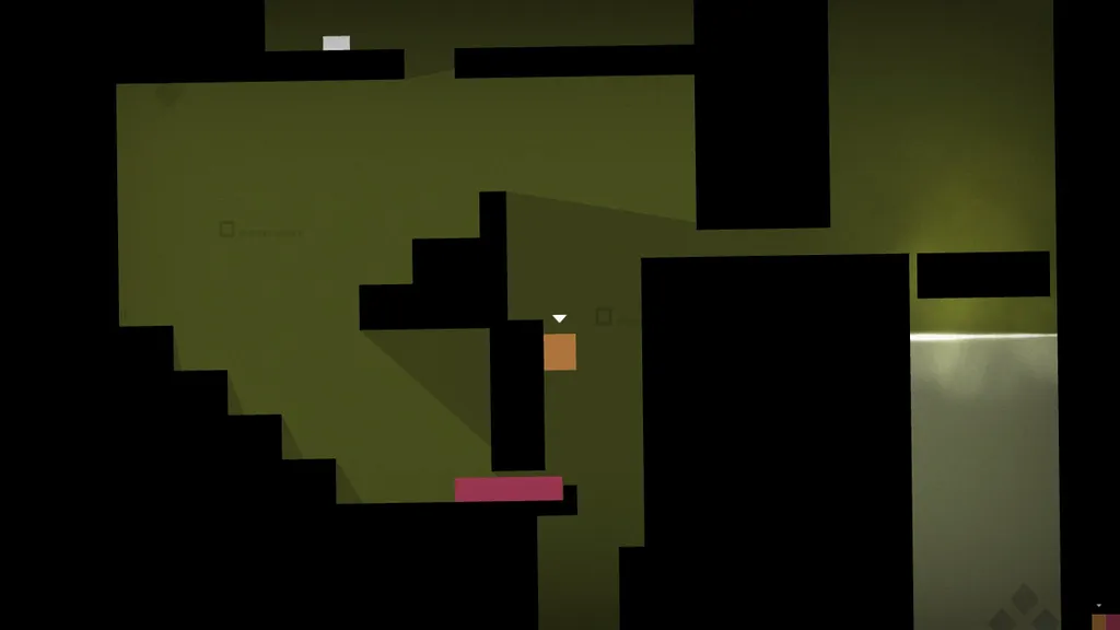
The difficulty of Thomas Was Alone video game increases as new characters are introduced with each level.
- Option to skip: this is an important and often overlooked principle which allows users to skip challenging tasks (either immediately or after several unsuccessful attempts) and still enjoy the rest of the game. This principle is common for open world games like The Legend of Zelda: Breath of the Wild and Valheim, where boss fights are optional, and less common for platformers. An interesting example is the mobile game Pokemon Go, which now allows players who lost a fight with a Team GO Rocket leader to rematch or exit the battle without losing the rocket radar — a special item players had to earn to initiate the fight. This gives players the flexibility to engage with the feature if and when they choose to, which is user experience done right!
8. Aesthetic and minimalist design
Interfaces should not contain information that is irrelevant or rarely needed. Every extra unit of information in an interface competes with the relevant units of information and diminishes their relative visibility.
Aesthetics play a huge part in game design, often taking the central stage. Adventure video games like Journey and RiME offer stunning visual experiences and are famed for setting new standards for visual and sound design in interactive entertainment.
Similarly, board games like Everdell, Wingspan and Mysterium are renowned for their aesthetic choices as much as game mechanics.
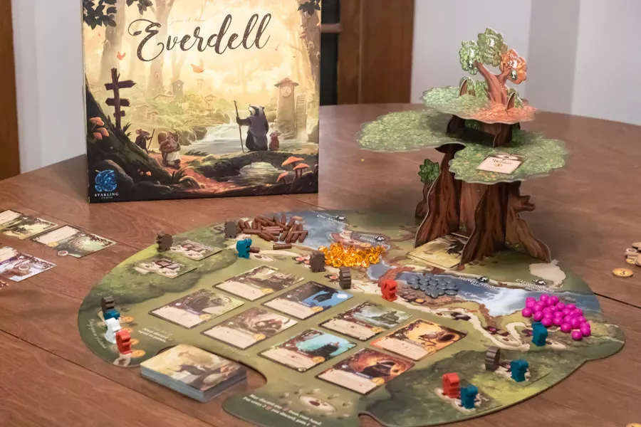
Games like Everdell are celebrated for their beauty as much as mechanics, both of which contribute of the overall player experience. Image source: Boardgame Geek.
While the style and importance of visual in game design is somewhat subjective, there is no denying their contribution to the overall player experience.
9: Help users recognise, diagnose, and recover from errors
Error messages should be expressed in plain language, precisely indicate the problem, and constructively suggest a solution.
We already discussed some aspects of error prevention (5) and recovery (3), but let’s look at a few other examples.
The most obvious way to stop players doing something they aren’t supposed to is making it impossible to accomplish: from guards blocking Link’s entry into Gerudo Town in the The Legend of Zelda: Breath of the Wild to underwater streams preventing Nuna and Fox from swimming in the wrong direction in Never Alone (Kisima Ingichuna), this sends a clear message that the player is attempting something they aren’t supposed to.
But there are other creative ways to deliver the same message. One of my favourite examples is Limbo and RiME both having special achievements for going in the wrong direction. This is a delightful experience which both rewards the player for exploring while also letting them know they made a mistake.
Another example of a well thought-through error recovery is an occult puzzle game Strange Horticulture where the player has to correctly identify plants in their collection. The players can, and sometimes have to, guess, but getting it wrong raises dread. After three mistakes, the player protagonist’s mind gets filled with dread and the player has to solve additional puzzles to recover. This is a well-balanced experience that motivates the player to take chances but discourages them from blindly guessing their way through the game.
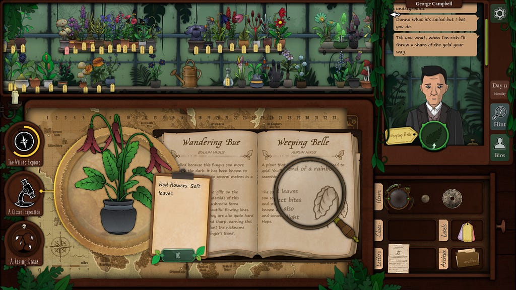
If a player misidentifies three plants in Strange Horticulture, they are faced with a more challenging puzzle that helps clear accumulated dread. This well-balanced experience that helps players progress but discourages them from blindly guessing their way forward.
10: Help and documentation
It’s best if the system doesn’t need any additional explanation. However, it may be necessary to provide documentation to help users understand how to complete their tasks.
Instruction manuals are essential parts of many complex games, and ensuring they are clear and easy to reference goes a long way towards improving the overall gaming experience. In fact, game rule book design is an article subject in its own right, as everyone has their favourites.
Tutorials can offer a good alternative or a supplement to a lengthy instruction manual. Boardgames like Wingspan or a digital adaptation of the tactical RPG Gloomhaven start with step-by-step tutorials aimed at new players learning the basic mechanics of the game (note that this is similar but slightly different from the examples discussed in heuristic 7, where tutorials are integrated into the game narrative).
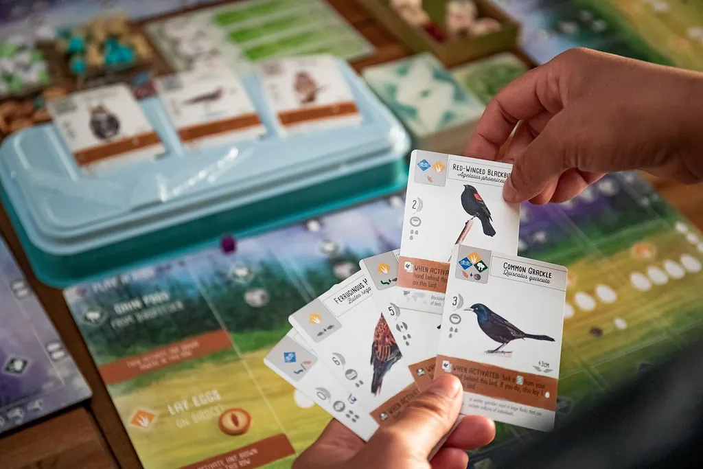
Games like Wingspan offer players an option to experience the first round in a form of a tutorial. Image source: Vox.
Thank you for reading, I hope you found this article interesting and useful! I recognise that it barely scratches the surface of a broad and complex subject of game design UX, so please share your thoughts and examples in comments!